Great branding used to start with a feeling. Now it begins with feeling plus quantifiable insights.
We live in an era where every scroll, click, and second of attention is measurable. For brands that want to lead, not just look good, designing based on that information is essential.
Welcome to the age of data-backed design: where insight meets imagination, and where creativity is shaped by what real users want, feel, and do.
In this guide, we’ll show you how to blend strategy and design by leveraging data as your advantage, unpacking the tools and frameworks that convert metrics into design momentum.
TL;DR: How Data Impacts Design Output
|
Why Data-Backed Design Matters Now
Brands are no longer building their logos, websites, social media, and internal content in a vacuum. Every interaction leaves a data trail, and the brands paying attention are the ones pulling ahead.
Market & Tech Drivers
With tools like GA4, FullStory, and AI-based heatmapping, businesses can monitor exactly how people interact with digital and visual experiences.
The rise of personalization, behavioral analytics, and UX optimization has impacted how design drives conversion. Research shows that:
- 94% of first impressions relate to design.
- Users form design opinions within 50 milliseconds.
- Brands that leverage behavior data outperform peers by 85% in sales growth.
Competitive Advantage
In a crowded market, great design goes beyond aesthetics to boost brand performance. Data-backed brands consistently outperform other companies by:
- Designing for their actual audience (not assumptions)
- Iterating faster based on real-time feedback
- Aligning design decisions with KPIs like engagement, retention, and sales
Companies that integrate design and analytics into a single workflow report over 2x the growth rate of those who don’t.
Core Principles of Data-Backed Design
So what does data-backed design look like? These are the foundational elements that ensure your creative process produces striking visuals and creates measurable, scalable, and deeply relevant content to your audience.
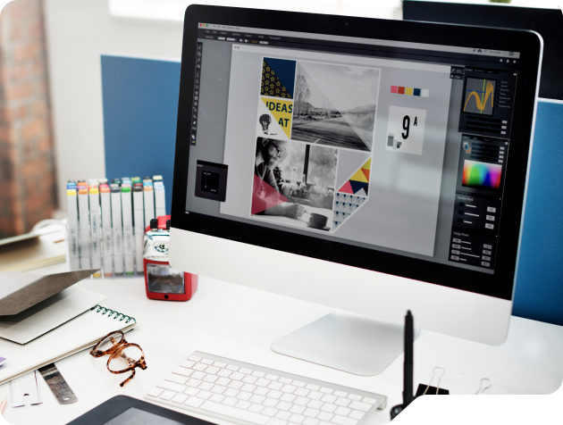
From Data Collection to Creative Direction
The best design starts with clarity, not color palettes. Data-backed design begins by capturing the right signals from your users and environment. Start by identifying five key data sets:
Behavioral Data. Track how users move, scroll, and click. These micro-interactions reveal attention, friction, and flow.
Demographic Data. Understand the audience: age ranges, income levels, geography, and device preferences. It shapes accessibility, visuals, and UX assumptions.
Psychographic Data. Look beyond numbers. What motivates them? What do they fear? What beliefs drive action?
Contextual Data. Consider the when and where: time of day, location, device usage, and even the emotional setting. These factors often influence how your content is perceived.
Performance Data. Tap into historical engagement metrics. CTR, bounce rate, form completion, and time on page will highlight what’s already working and what needs improvement.
Together, these insights turn your numbers into a purposeful design direction. They help clarify your layout, messaging tone, visual choices, and user flow long before any pixel is pushed.
Blending Context With Creativity
Even with all the data in the world, creativity still sways your customers’ perception of your brand. The role of data is to guide the process, not govern your output.
- Use heatmaps to see where users focus, and place design elements accordingly.
- Pull the language your customers use in reviews into content and typography.
- Adjust spacing and visual flow based on real-time engagement stats.
- Apply insights directly to wireframes and prototypes to guide layout decisions.
By marrying left-brain logic with right-brain resonance, you design experiences that perform and connect. That’s the creative sweet spot.
Iterative Testing & Optimization
Think of testing as a continuous creative loop rather than a quality checkpoint. Strong brands continually design, test, listen, and evolve their offerings.
Here’s how to build that rhythm:
- A/B Testing: Perfect for simple comparisons such as hero headlines, CTA colors, or banner placements.
- Multivariate Testing: Ideal when you’re ready to analyze combinations of multiple design elements at once.
- UX Feedback Tools: Tools like FullStory and Hotjar enable you to see what users are doing, including where they pause, rage-click, or abandon the page.
- Surveys & Polls: Quantify sentiment with simple questions. Why didn’t they scroll further? Why didn’t they submit the form?
This kind of ongoing optimization builds brand trust from the inside out. Your team becomes more confident. Your audience feels more understood, and your creative becomes a living, learning system.
How Brands & Designers Can Implement It
Theory is helpful, but activation is everything. Now that you know what data-backed design is and why it matters, how do you make it real inside your organization?
Step-by-Step Framework
It starts with intention. A clear roadmap helps eliminate overwhelm and ensures every member of your team knows which direction to travel. Here’s one proven approach:
- Audit and align. Review current brand assets and UX performance. Identify disconnects between what’s live and what users are experiencing.
- Define success. Establish KPIs tied to specific goals, including increased sign-ups, improved engagement, and reduced drop-off rates.
- Collect data. Pull from a blend of qualitative and quantitative insights, such as session recordings, surveys, heatmaps, and behavior flows.
- Test and iterate. Launch new versions, isolate variables, and measure impact.
- Document learnings. Build a system of continuous improvement, not just campaign-based testing.
Building a Data-Literate Design Culture
Even the best process falls flat without overall buy-in.
Data-driven design requires collaboration among key stakeholders across all departments, including analysts, creatives, strategists, and customer support teams.
Encourage shared ownership of insights and outcomes. Designers should understand KPIs. Marketers should contribute to wireframes. Leadership should advocate for experimentation.
Data becomes a culture when it becomes a language everyone speaks.
Recommended Tools & Platforms
There are plenty of tools that can drive the adoption of data-driven design. However, you don’t need them all to start.
Here is a list of some of the most essential data-gathering tools to help you add more data to your design process:
- Analytics: GA4, Looker Studio
- User Feedback: Hotjar, FullStory, Typeform
- Testing & Research: Maze, PlaybookUX
- Design & Prototyping: Figma, Adobe XD
It’s best to choose tools that serve your immediate needs, then layer in complexity as your process matures.
Why Teams Should Balance Data With Creativity
The term “data-backed” can sound like a creative constraint. However, data provides direction for great design when used effectively.
The goal isn’t to replace intuition. It’s to sharpen it.
Let Data Guide, Not Dictate
Creative ideas are still what win your audience over, but they win faster when shaped by validated insights.
- Use data to reveal where attention fades or friction grows.
- Let insights direct your focus, not narrow your imagination.
- Think of it as a blueprint, not a cage.
The designer’s job isn’t to follow the numbers. It’s to interpret them in a way that multiplies impact.
Use Human Insight to Fill the Gaps
Metrics can show the “what.” Human feedback shows the “why.”
Talk to real users. Listen for emotional friction. Social comments, interviews, and support tickets often reveal what dashboards can’t: tone mismatch, layout confusion, or messaging that doesn’t resonate.
These human signals are what transform optimization into resonance.
Collaborative Workflows That Work
No modern design team thrives in a silo. Aligning creative with analytics early on can drive clarity, cohesion, and results.
- Begin by establishing shared KPIs in your design briefs.
- Review creative alongside data during sprint check-ins.
- Debrief together after launch with both brand and performance lenses.
A tight feedback loop accelerates iteration and deepens brand alignment. That’s how you build design systems that don’t just look good, but work hard.
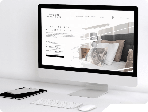
Applying Data to Visual Design Decisions
Knowing what to test is just as important as testing itself. Here’s how to turn insight into informed design choices without sacrificing aesthetic integrity.
Typography
Typography sets the tone and creates structure. Heatmaps and scroll data reveal where users engage or drop off, indicating whether your type hierarchy is effective.
If key messages are skipped, refine headings, adjust font weights, or increase contrast. Real-time behavior can guide everything from line spacing to headline phrasing.
Color
Color influences perception, urgency, and emotional tone. Low engagement or weak CTA clicks often signal that your palette lacks contrast or relevance.
Test color pairings and saturation across buttons and backgrounds to ensure optimal visual consistency. Let your audience’s response, not your preference, define your visual hierarchy.
Spacing and Layout
Layout controls cognitive flow. If users stall, abandon, or skip sections, spacing and information density may be the culprit.
Use scroll maps to identify friction points. Adjust grouping, white space, and pacing to guide your audience’s attention where you want them to focus.
Imagery and Iconography
Visuals create instant emotional context. But irrelevant or overly stylized imagery can distract, confuse, or alienate your audience.
Behavior tracking shows where engagement drops near visuals. Swap in imagery that reflects user context, whether that be demographic, cultural, or environmental.
Microinteractions
Small touches leave a big impression. When microinteractions misfire, they frustrate instead of delight.
Hover and rage-click data reveal gaps in feedback loops. Refine animations, add cues, and simplify gestures to build user confidence at every step.
Frequently Asked Questions About Data and Design
What is data-backed design?
It’s the process of using real user data to shape, test, and improve creative decisions across branding, UX, and marketing.
Do I need expensive tools to add data to my design process?
Not at all. Many tools, such as GA4 and Hotjar, are either free or very affordable for teams just getting started.
Can small teams use this approach?
Absolutely. Even small-scale testing can yield powerful insights. It’s about structure and consistency, not size.
How do I balance my insights with creativity?
Use data to focus your creative energy, not replace it. The best ideas are rooted in insight and brought to life with originality.
What kind of ROI can I expect on data-backed design principles?
Brands that integrate design and data tend to see faster iteration cycles, improved conversion rates, and more scalable brand growth.
Reimagine Your Data-Focused Brand with AVINTIV
If you’re building a modern brand, you can’t afford to guess. Adding data to your design tactics doesn’t replace creativity — it amplifies it.
At AVINTIV, we help brands connect insights to execution, turning raw data into refined identity.
Schedule your discovery call with us to receive a customized brand audit tailored to your market.