Your brand might speak volumes, but it won’t be heard if it doesn’t look the part.
Visual branding is about more than aesthetics. The proper branding can drive clarity and help you make a greater impact, but the wrong branding can turn away potential leads before they even consider making a purchase.
Let’s break down the framework that turns good design into real brand power.
TL;DR: What You’ll Learn
|
What Is Visual Branding? (And Why It’s Not Just About Looking Good)
Before you can elevate your brand visuals, you need to define what visual branding means and, more importantly, what it needs to accomplish. It’s not about surface-level design or simply “looking good.”
It’s about creating a powerful first impression that supports your brand’s market position and instills immediate trust.
Visual branding is the strategic expression of your identity through design. It encompasses every touchpoint — your website layout, packaging, slide decks, social posts, and signage — and ensures they all send the same signals.
Why does this matter? Color alone accounts for up to 90% of judgments made about products, according to a 2020 study published on color psychology in marketing.
A single glance could be the difference between a bounce and a sale.
The Science of Color in Branding
Color is the first impression you don’t get to explain. Before users read your headline or scan your offer, their brain is already processing whether you’re credible, and color is a primary cue.
The human mind responds to visuals 60,000 times faster than text, using color to quickly assess familiarity, professionalism, and relevance.
If your brand visuals aren’t working together, that first impression could cost you far more than you realize.
How Color Psychology Influences Decisions
Color selections can trigger hardwired responses in the human brain. For example:
- Red activates the amygdala, triggering a sense of importance or warning.
- Blue slows the heart rate and is often linked with dependability.
- Yellow stimulates mental activity and optimism.
- Green suggests balance and nature, calming the nervous system.
Color psychology is rooted in evolutionary behavior and reinforced by cultural conditioning, directly impacting buying behavior. Research from Colorcom shows that color can increase brand recognition by up to 80%. It also plays a critical role in brand perception and emotional response.
When color aligns with brand values and audience expectations, it becomes an emotional shorthand that builds trust before a word is read.
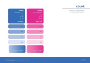
How to Choose a Color Palette That Supports Growth
Your brand’s palette should do more than look good. It should feel intentional, scalable, and psychologically aligned with your mission. Start with:
- A primary brand color: This is your core brand anchor. It should reflect your personality and elicit the emotional response you want customers to associate with you.
- Secondary colors: These add depth and flexibility, supporting different use cases while staying harmonious with your core brand identity.
- Accent hues: Used sparingly, these help draw attention — great for call-to-actions, links, or alerts.
Ensure your palette works on both light and dark backgrounds. Use high-contrast pairings for accessibility and build in alternatives for digital vs. print environments.
Different industries lean into different color cues. Tech often goes blue for trust, while health brands lean green or white for cleanliness and vitality, and luxury brands opt for black or deep jewel tones for sophistication.
When you work with us at AVINITV, we help you align color strategy with brand positioning. Every shade is selected with audience psychology, differentiation, usability, and platform-readiness in mind.
We don’t just ask what looks good. We ask: What does this color say to the people you want to reach?
Typography: The Silent Brand Multiplier
Fonts aren’t just visual. They send immediate signals about your brand’s professionalism, tone, and positioning — often within the first second of user interaction.
The Psychology of Fonts: First Impressions Start Here
Typography carries emotional and psychological weight. Before your audience reads a single sentence, your font sets the tone.
Serif fonts, such as Garamond or Times New Roman, communicate tradition, reliability, and sophistication — ideal for brands positioned as legacy or high-end.
Sans-serif fonts, like Helvetica or Montserrat, convey modernity, clarity, and minimalism — often used in tech, wellness, and lifestyle brands.
Because fonts shape how your content feels before it’s read, they influence subconscious reactions, guide visual flow, and either enhance or detract from credibility. A clunky or inconsistent font distracts, while a clean, purposeful typeface builds trust, professionalism, and brand memorability.
Typography provides structure by creating hierarchy, improving comprehension, and signaling attention to detail. The wrong font choice in digital branding can instantly signal amateurism, even when the product or service is premium.
How to Structure a Scalable Font System
As your brand grows, your typography must adapt across platforms, devices, and formats without compromising its impact. That’s where a font system, not just a font choice, comes into play.
Every high-performing brand should define a font hierarchy:
- Heading font: Used in H1–H3 styles, it must capture attention and convey brand personality.
- Body font: It should be highly legible across screen sizes and support long-form content without fatigue.
- Accent font: Optional but helpful for buttons, CTAs, quotes, or design overlays. It adds contrast and emphasis.
Scalable font systems prioritize:
- Responsiveness: Fonts should adapt seamlessly across mobile, tablet, and desktop.
- Licensing: Use licensed or open-source fonts that align with commercial use.
- Consistency: Apply fonts according to defined rules in your style guide — spacing, weight, casing, and alignment.
Typography should never be an afterthought. Be sure to vet every typeface for usability, alignment with brand values, and performance across key digital and print touchpoints.
Why Visual Consistency Is the Secret to Brand Memory
Visual consistency is the key to successful visual branding. People don’t remember brands that look different on each platform because inconsistency creates confusion, not connection.
Inconsistency Weakens Brand Recognition
Brand recognition thrives on repetition and clarity.
When your website, packaging, email graphics, and social feeds look disconnected, you dilute your identity. Audiences second-guess whether they’re engaging with the same brand or if they can trust you.
Inconsistency undermines your brand’s authority. It creates friction in the user journey and forces the audience to relearn who you are along the way.
Consistency, on the other hand, builds brand memory. It teaches your audience to recognize and trust you at a glance, accelerating loyalty and conversions.
Every time a customer sees your visuals and connects them with your promise, you reinforce your position in their mental shortlist.
How to Build Visual Systems That Scale
Maintaining visual consistency at scale is about empowering your team with systems. A scalable brand doesn’t wing it. It creates detailed, enforceable documentation that ensures alignment across platforms and departments.
Key components of a scalable visual system include:
- Logo usage rules: Define acceptable variations, spacing, and sizing. Prevent distortion, crowding, or misuse.
- Color and font specifications: Establish approved brand palettes and font families, with usage guidelines for headers, body text, and accents.
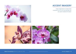
- Image and iconography styles: Set rules for photography tone, illustration style, and icon treatment to ensure cohesive visual storytelling.
- Responsive and cross-platform adaptations: Account for how your visuals should scale or shift across desktop, mobile, and print.
At AVINTIV, we don’t just design — we systemize. Our brand kits are engineered for long-term growth and team-wide adoption, ensuring your brand shows up powerfully and consistently whether it’s seen on a billboard, website, or social ad.
The Complete Visual Branding Framework: Step-by-Step
Visual branding isn’t a single decision. It’s a holistic system built on three foundational pillars: color, typography, and consistency. Here’s how to put them into action:
1. Start with Color
Choose a core color that reflects your brand personality, then build out a supporting palette with psychological intent.
Consider emotional triggers, accessibility standards, and digital vs. print performance. Your color system should be instantly recognizable and functional across all platforms.
2. Define Your Typography System
Select typefaces that align with your tone and messaging hierarchy. Establish a primary heading font, a readable body font, and an optional accent type.
Establish standards for usage, spacing, and responsiveness to ensure your text appears polished, regardless of its context.
3. Create Rules for Consistency
Codify everything into a visual brand guide. This includes logo usage, spacing rules, visual dos and don’ts, and adaptive design specs for multi-channel consistency.
The goal is to make it impossible for your team to go off-brand, even as you scale.
Together, these three elements create a visual identity that communicates confidence, credibility, and intentionality — the brand equivalent of arriving sharp and prepared to every meeting.
Quick Self-Audit Checklist:
- Do your last 5 Instagram posts visually align with your site?
- Are your website header, footer, and buttons using the same fonts and colors as your print materials?
- Does your pitch deck or lead magnet feel like it came from the same brand?
If you answered “no” to any of the above, you’re leaving brand equity on the table. That’s your visual gap, and it’s time to close it.
How to Know It’s Time for a Visual Branding Refresh
Visual branding doesn’t need to be broken to hold you back. Sometimes the clearest indicator that it’s time for a refresh is misalignment between your visual identity and your current position or goals.
Ask yourself these questions:
- Have you scaled your operations, team, or client base, but your branding still looks like it belongs to a much earlier stage?
- Do internal team members frequently ask for branding clarification or struggle to stay “on brand” without guidance?
- Have you recently clarified or elevated your brand messaging, but your website and visuals don’t reflect that new direction?
- Are you attracting leads that are not aligned with your pricing, services, or values?
- Do you feel like your visuals don’t match the caliber of your offering?
If you answered yes to any of the above, it’s time to consider a visual reset. Solid branding closes the gap between who you are now and what your brand signals to the world.
Let’s Elevate How the World Sees Your Brand
If you’ve made it this far, chances are you know something needs to change, but you may not have the time, clarity, or in-house bandwidth to do it right. That’s where we come in.
At AVINTIV, we don’t just deliver design. We craft strategic visual systems that align your branding with the scale of your ambition.
Whether you’re leveling up your messaging, attracting a new caliber of client, or ready to reposition your brand in the market, your visuals need to lead the charge.
Schedule a discovery call today to learn more about how we can help you make an impact!